


project concept haircare identity + packaging

brief
concept haircare built to feel current and punch on the shelf, for people who treat their hair as part of the outfit. the design language is strong and direct, and it still had to be beautiful.
idea
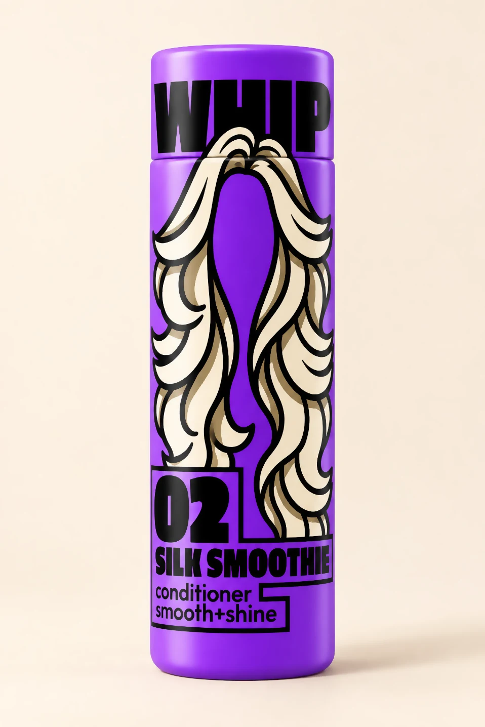
whipped hair, somewhere between a fresh blowout and a spoon of whipped cream. every product carries its own hair shape (curls for the shampoo, long and glossy for the conditioner, big soft waves for the mask), drawn thick and black like the type.
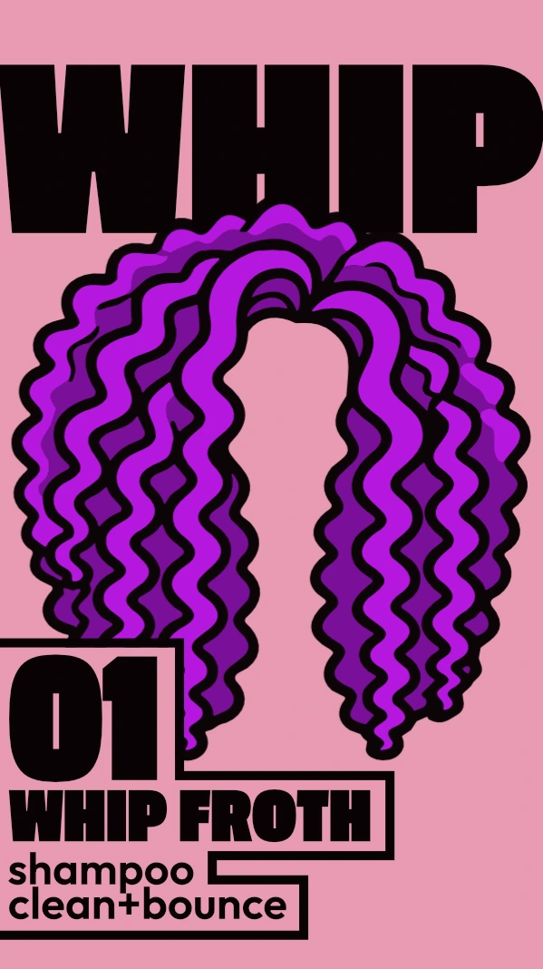
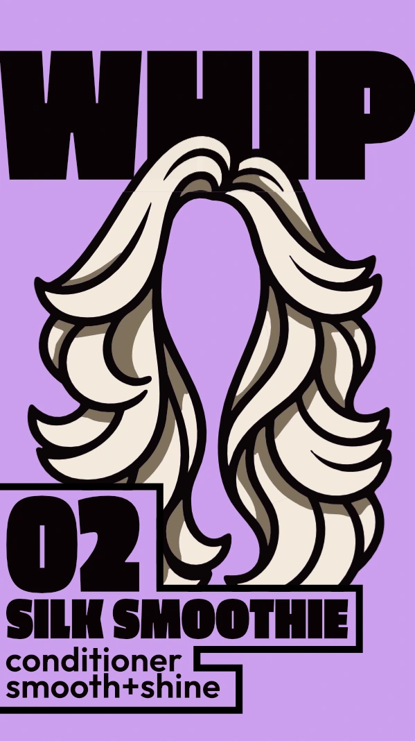
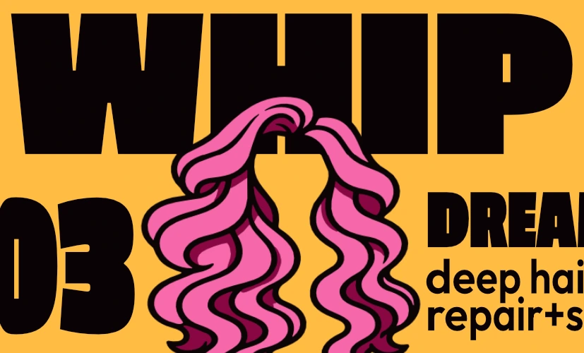
the range
- 01whip frothshampoo · clean + bounce
- 02silk smoothieconditioner · smooth + shine
- 03dream creamdeep hair mask · repair + soften

boxing
every product comes boxed. the box is black, so the colors and the hair do all the talking, and each side panel carries the product color so the range still reads from any angle on the shelf. the full name, WHIP DREAMZ, lives on the box; the bottle inside just says WHIP.

color
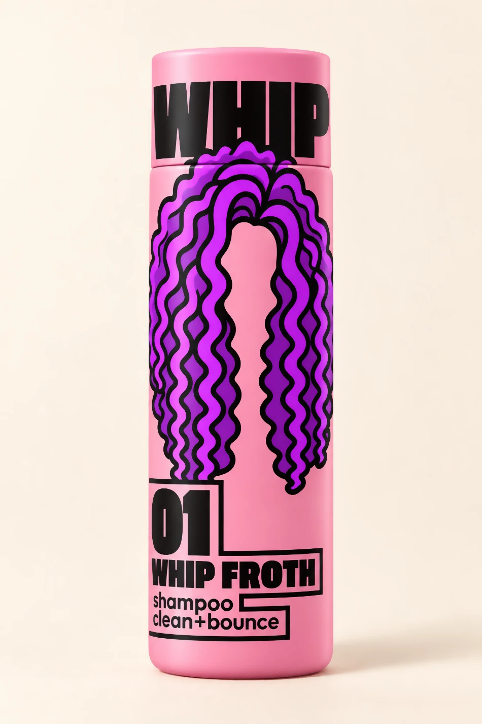
one color per product, bottle and cap included. the yellow started as butter yellow and was pushed towards amber to give the range a more fashion feel.
- rose#e89ab3 · whip froth
- lilac#cc9fee · silk smoothie
- amber#ffbc44 · dream cream
type
passion one black for the wordmark and product names, outfit semibold for everything else. WHIP runs across the cap line on every bottle and jar, so opening it splits the logo. product details sit in outlined boxes.
what we made
naming, logo, illustration system, bottles and boxes for three products, color and type rules.